The following Tornado Analysis example uses a Crystal Ball example model, Reliability.xls. This spreadsheet model predicts the reliability of a spring using three different construction materials.
To generate charts, the Tornado Analysis tool is run against the Material 1 Reliability forecast using the following option settings:
Tornado method = Percentiles of the variables.
Test range = 10% to 90%.
Test points = 5.
Base case for Crystal Ball variables = Use existing cell values.
Results location = New Workbook
Tornado output = Tornado chart and Spider chart.
Show __ top variables = 20.
Chart Options = defaults (Tornado Chart Options)
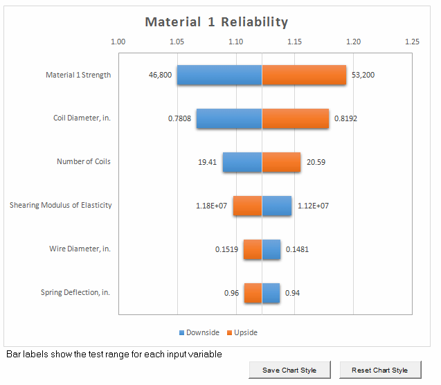
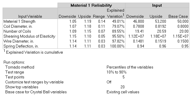
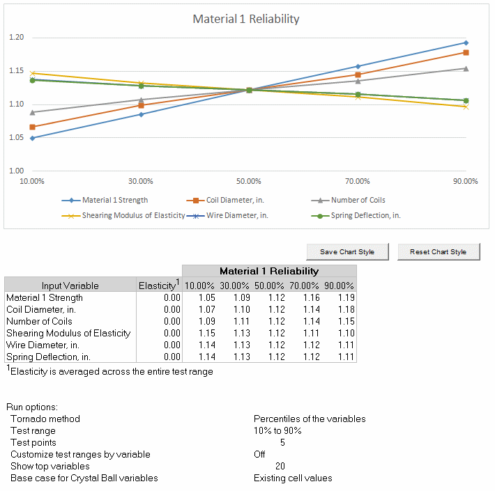
For this example, the tool creates the tornado and spider charts in their own workbook with data tables as shown in Figure 56, Tornado Chart, Figure 57, Tornado Chart Results Data, and Figure 58, Spider Chart with Data.
Six assumptions are listed in the tornado chart (Figure 56, Tornado Chart). The first assumption, Material 1 Strength, has the highest sensitivity ranking and is the most important. A researcher running this model would investigate this assumption further in the hopes of reducing its uncertainty and, therefore, its effect on the target forecast, Material 1 Reliability.
The last two assumptions, Wire Diameter and Spring Deflection, are the least influential assumptions. Since their effects on the Material 1 Reliability are very small, you can ignore their uncertainty or eliminate them from the spreadsheet.
You can use Microsoft Excel's chart formatting features and the tornado chart options (Tornado Chart Options) to change the appearance of the chart.
Tip: | To save the new format as a template, click Save Chart Style. Click Reset Chart Style to restore original defaults. These settings will only affect future runs of the tool. |
Tornado analysis data is displayed below the chart (Figure 57, Tornado Chart Results Data). The results table shows the following:
The input variable names in chart order, starting with the variable with the greatest impact on the target
The downside difference from the base case
The upside difference from the base case
The percent of explained variation in the target, approximately equal to statistical variance (R2), cumulative from the variable with the greatest impact to the least
The absolute downside value
The absolute upside value
The base case value
A list of tool option settings is displayed below the results table.
The spider chart shows similar information (Figure 58, Spider Chart with Data). Generally, variables that appear at the top of the tornado chart have the steepest slopes in the spider chart. Notice that more forecast values are given in the spider chart than in the tornado chart, one for each of the test points within the test range. An elasticity statistic is displayed in the first column to show the percentage change in output for each percentage change in input. The elasticity statistic is averaged across the entire test range for each variable to present a more robust calculation. The specific formula used is called the “arc elasticity” which results in the same statistic being computed regardless of which test value (upper or lower) is used as the starting point.
You can format the chart with Microsoft Excel formatting features and the chart options (Tornado Chart Options). Then, you can use the Save Chart Style button to use the current formatting in future spider charts. Use Restore Chart Style to use default formatting.