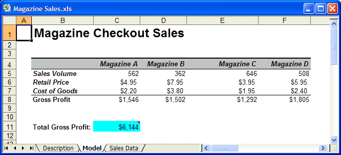
The analysis example for the Data Analysis tool uses a Crystal Ball example model, Magazine Sales.xls. This model shows the estimated gross profit resulting from newsstand sales of four of the company’s most popular magazines (Figure 74, Magazine Sales Workbook). The accompanying Sales Data worksheet contains historical data for each of the four magazines.
This example shows how to analyze the data by importing the data into the Data Analysis tool, automatically creating a forecast for each magazine, running a simulation, displaying the simulated data as forecast charts, correlating the forecasts for each magazine, and producing other charts using buttons in the DataAnalysisOutput worksheet generated by the tool.
When the workbook is opened to the Sales Data sheet, correct input data is automatically selected when the tool starts. For this example, Options settings are as follows:
AutoSelect defaults are set on the Fit Options panel.
When the Data Analysis tool runs, it creates:
A new workbook with data and buttons on a worksheet named DataAnalysisOutput, similar to Figure 75, Data Analysis Output worksheet.
Cells B2 through E2 contain forecasts, one for each series of magazine data.
Below that is a correlation matrix, showing the relationship of each forecast to the other three.
Cell A1 contains four buttons you can use to display forecast, trend, overlay, and scatter charts.
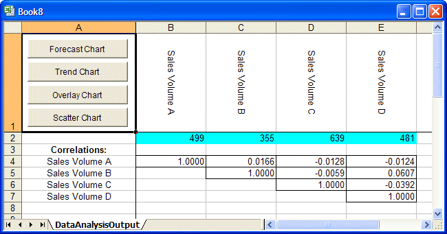
You can use the chart buttons to analyze the newly generated forecasts. For example, select the row of forecasts and click the Forecast Chart button. Then, to see which type of distribution fit best, select a chart and select View, and then Goodness of Fit.