 To create a sensitivity chart:
Confirm that Store assumption values for sensitivity analysis is selected and click OK.
Select Analyze, and then Sensitivity Charts.

(In Microsoft Excel 2007 or later, select Analyze, then View Charts, and then Sensitivity Charts.)
In the Choose Forecast dialog, select the forecast to include in the chart.
Click OK to create a new sensitivity chart (Figure 37, Sensitivity Chart for the Selected Forecast).
Note:
The illustrated chart has a transparency effect applied using the chart preferences to make sensitivity values easier to read (Setting Special Chart Effects).
The assumptions are listed beside the bar chart, starting with the assumption with the highest sensitivity. If necessary, use the scroll bar to view the entire bar chart. You can drag the edges of the chart to resize it — make it narrower, wider, taller, or shorter. This often changes the tick labels along the top of the chart.

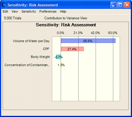
One or two assumptions typically have a dominant effect on the uncertainty of a forecast. In Figure 37, Sensitivity Chart for the Selected Forecast, the first assumption accounts for approximately 65% of the variance in forecast values and can be considered the most important assumption in the model. A researcher running this model would want to investigate this assumption further in the hopes of reducing its uncertainty and, therefore, its effect on the target forecast. The last assumption contributes the least to forecast variance (about 2%). This assumption has such a small effect, it could be ignored or altogether eliminated by clearing it from the spreadsheet.