 To work with Predictor data in interactive tables:
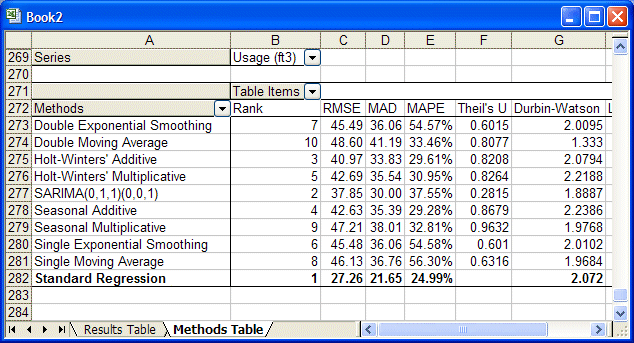
Next to the Series button, select Average Temperature from the list and click OK.
The table changes to show the parameters and statistics for each method of the Average Temperature forecast.
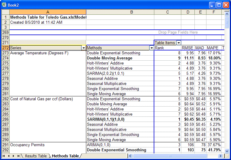
Click the Series button and drag it to the left of the Methods button.
The Methods table expands to include all the data series. When you drop the Series button next to the Methods button, the list of methods repeats for each series (Figure 19, Methods Grouped by Series).
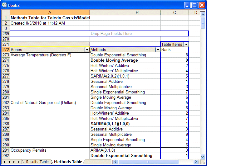
Click the arrow to the right of the Table Items button.
A list is displayed.
Clear all the items except for Rank and click OK.
The Methods table changes to show the Rank parameter. Look at the Average Temperature data. In the Methods column, Double Moving Average is labeled Best method and highlighted in bold text to show that it was used to generate the results. Seasonal Additive, originally the best, is still listed with a rank of 1 (Figure 20, Methods Within each Series Identified by Rank).
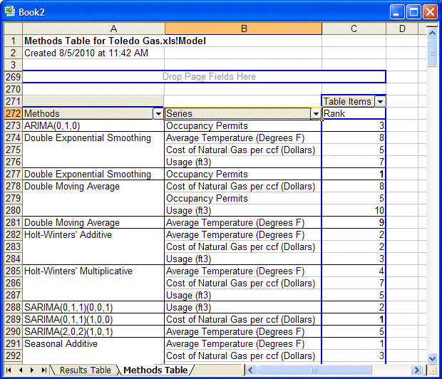
Move the Methods button to the left of the Series button.
The interactive Microsoft Excel PivotTable reorganizes to show all the series grouped by method type as shown in Figure 21, Series Grouped Within Methods.
For more information about using interactive Microsoft Excel PivotTables, see the Microsoft Excel online help.