After completing a simulation with multiple related forecasts, you can create an overlay chart to display the relative characteristics of those forecasts on one chart. The frequency data from selected forecasts is superimposed in one location to show similarities and differences that otherwise may not be apparent. There is no limit to the number of forecasts you can view at one time on an overlay chart.
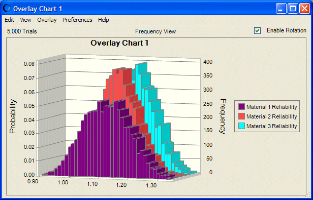
Figure 29, An Overlay Chart with 3D Formatting and Rotation shows the relative reliabilities of three manufacturing materials.
Note: | Figure 29, An Overlay Chart with 3D Formatting and Rotation and other figures may differ from the default view. |