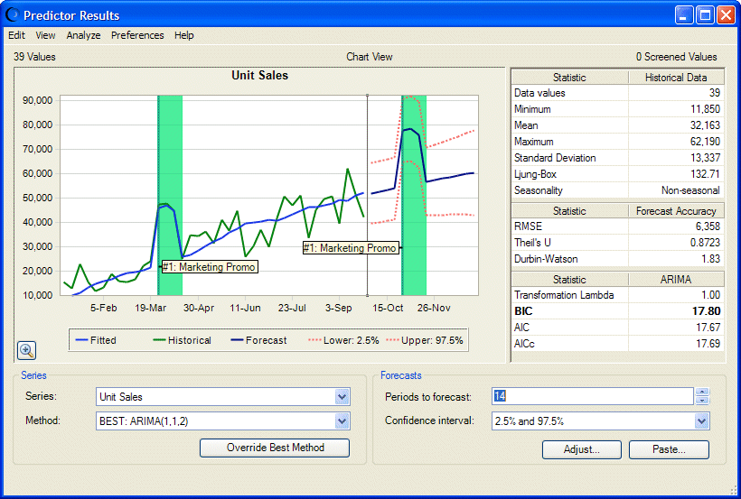
The Predictor Results window (Figure 7, Predictor Results Window with Shampoo Sales Results Including Events) is similar to the Historical Data dialog described in Viewing Historical Data by Seasonality.
The Series group determines which data series is displayed. If you forecasted results for more than one series, look at all results by selecting each series in the Series list.
By default, the displayed information is calculated using the forecasting method listed as BEST. You can view a different method for each series if you want. The methods are ordered from best to worst.
You can override the best method to calculate results using the new “best” method. This change only affects the current series. The other series remain unchanged unless you select one and override its method also.
If you change the method selection for a given series and then select another series and come back to the original series, it is the best method for the original series that is selected (not any non-best selection that may have been active when the series was changed). To always view a particular method when a particular series is selected, the best method should be overriden for that series.
The chart of series data values includes historical and predicted, or forecasted, data. Plots of raw data values and fitted values are displayed for historical data. Forecasted data values are enclosed by lines that show the upper and lower confidence intervals (described in Selecting a Confidence Interval). You can use Ctrl+p to display and hide confidence interval lines on the chart.
In the case of a dependent regression variable, the forecasted values are a function of the best forecast methods (or overridden best forecasting methods) of the independent variables.
If you have defined at least one event and selected Include events in the Data Attributes panel, a shaded vertical bar displays through historical and predicted data defined as events. You can select Preferences, and then Highlight Events to hide these bars and display them again (see Figure 7, Predictor Results Window with Shampoo Sales Results Including Events).
Note:
You can also select Highlight Seasonality and Highlight Screened Data to show or hide indications of seasonal cycles or filtered data if those features if they are selected in the Predictor wizard and included within displayed data.
In the upper-right is a table of statistics for the raw historical data.
Below the historical statistics are error statistics for the forecasted data values.
At the bottom of the statistics table are parameter values for the currently selected forecasting method.
For more information about these parameters and statistics, see the Glossary in this document and the Predictor sections of the Oracle Crystal Ball Reference and Examples Guide.
The Forecasts group is used to change the number of time periods to forecast and to select confidence interval boundaries. See Entering the Number of Time Periods to Forecast and Selecting a Confidence Interval.
You can also use the Adjust and Paste buttons to adjust missing values and outliers (extreme values) and paste forecasted values into the Predictor model (Adjusting Forecasted Data and Pasting Predictor Forecasts).
You can right-click within the Predictor Results window to display a menu with related commands.
For additional information, see Selecting How to Display and Analyze Results.